As the Age of Toddling approaches, my wife and I have determined that our apartment is a deathtrap. The tall cabinet in which we store toys and baby blankets? The bottom door’s latch is a little stiff, and if our guy tugs on the handle hard enough, he’ll pull the whole thing over on himself. The vintage stereo cabinet with those nice crisp wedge-shaped edges? Uh. The Art Deco table with the mirrored top (unattached, held in place only by its own weight)? Don’t ask. Plus dangling power cords, loose cables, and power strips tucked under everything.
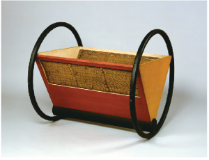
When you think about it, the past 60 years’ worth of Good Design has often also been definitionally Bad For Babies. Yes, there is the blobjects trend, but the fact is that modernism has fundamentally been about hard edges and crisp corners, both of which are far from child-friendly. The designers at the Bauhaus did acknowledge that children exist, creating kids’ furnishings and toys, but those folks didn’t have the slightest notion of baby safety. (See photo at right. That’s a CRADLE, people. Presumably the weight of the baby keeps it from rolling over. Presumably.)
Not that I believe in endless practicality. A quick trip through the safety gear at Babies ‘R’ Us is, if you are at all design- inclined, a quick route to despair. Everything’s as clinically ugly as can be, and there’s just so much almond-colored plastic. Bifold-door finger-pinch guards. A rail for the front edge of your stove that looks like a deli sneeze guard. A strut to keep your child from pulling a flat-panel TV over onto him- or herself. Spend ten minutes in this aisle, and even if the aesthetics don’t depress you, you risk turning yourself clinically paranoid, spotting hazards at absolutely every turn, and uglying up your house accordingly.
As far as I know, there’s no home-furnishings designer who aims straight at the new-parent market, deliberately attempting to reconcile good lines with rubbery corners. Even Ikea, which has a whole big department devoted to kiddie furniture, seems to keep edges crisp and surfaces hard. Until that clever (and sure-to-be-a-success) business shows up in malls across America, you will find me finding me screwing that tall storage cabinet down with angle irons, griping all the while about what it’s doing to the floors. And wiping spitup off a (padded, soft-edged, entirely nonthreatening) Eames chair. We do what we can.

Comments are closed.